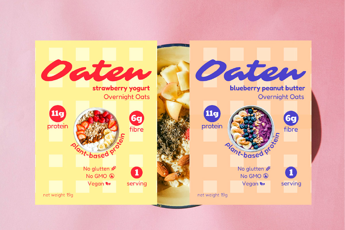
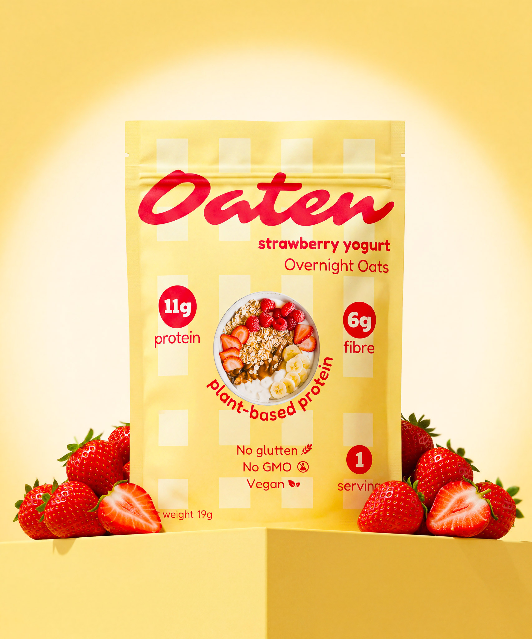
Oaten packaging design
Oaten is a plant-based overnight oats brand built around clean nutrition — gluten-free, non-GMO, and vegan. The packaging is about communicating health and wholesomeness without falling into the trap most health food brands fall into — cold, clinical, and forgettable. For Oaten, Healthy doesn't have to be boring. The packaging can be felt nutritious and trustworthy — but also modern enough to stop a scroller.
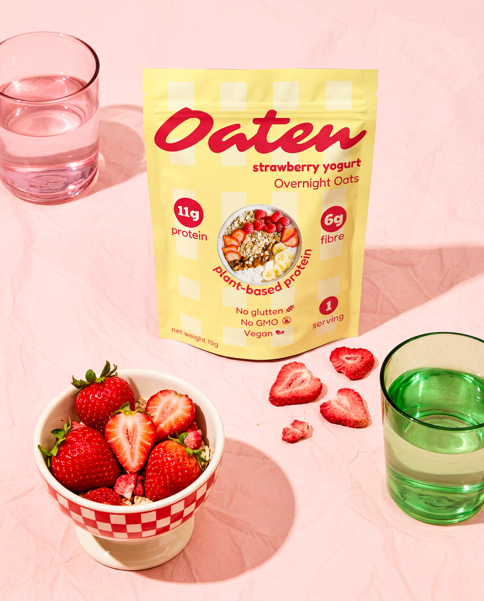
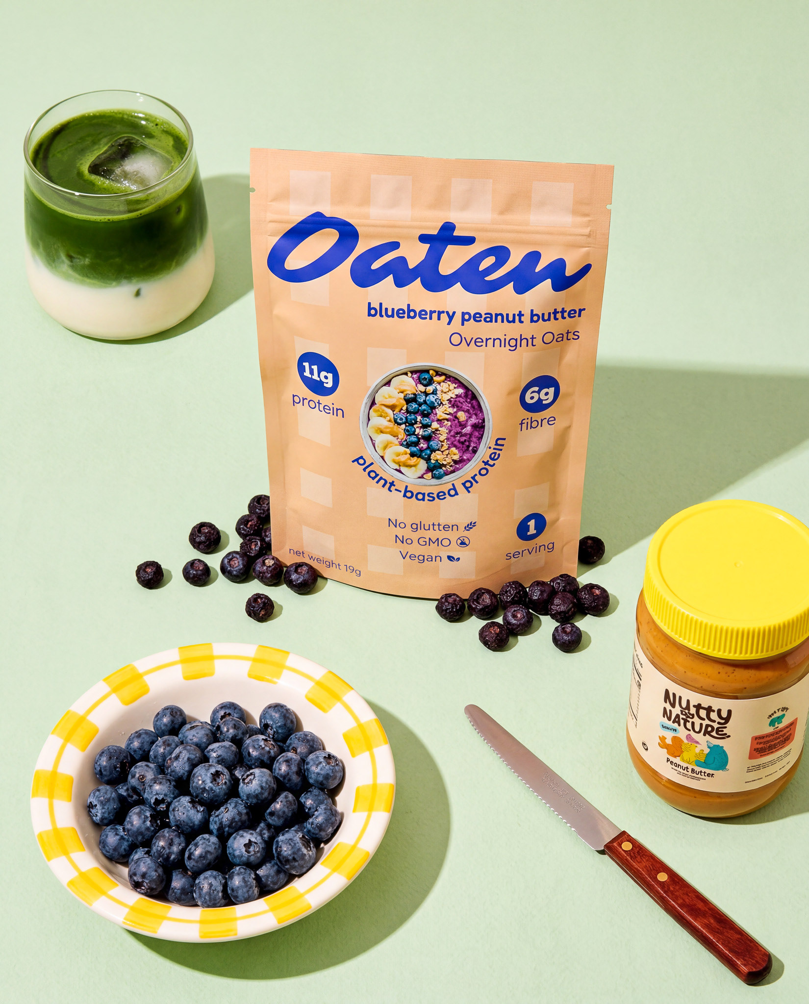
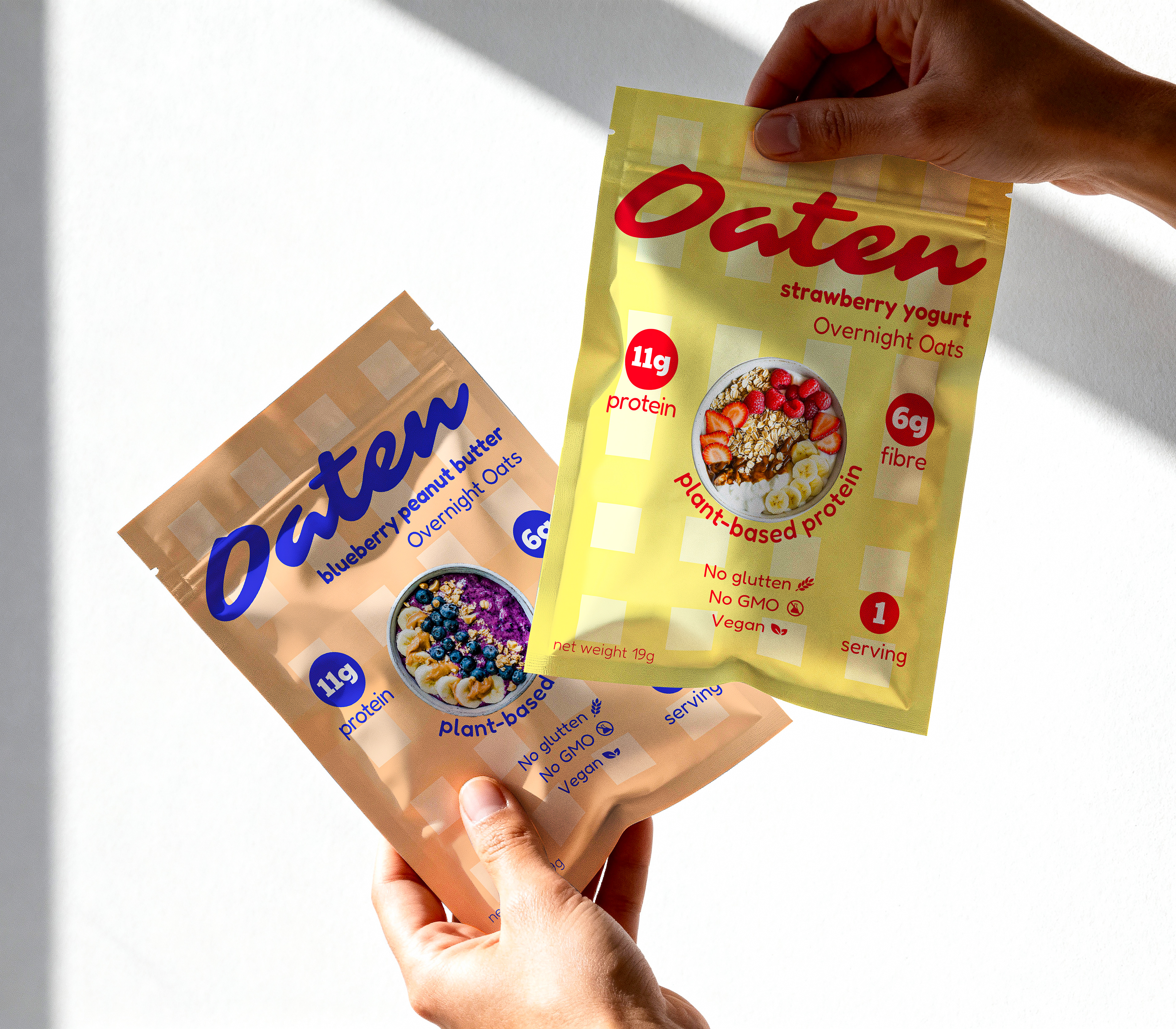
Logo mark "Oaten" is friendly, warm and trustworthy. All infos are written in sans-serif with the purpose of clarity and readability.
Bold circular badges (11g protein, 6g fibre) for callouts that can be scannable at a glance for customers..they can see the benefits immediately and clearly enough.
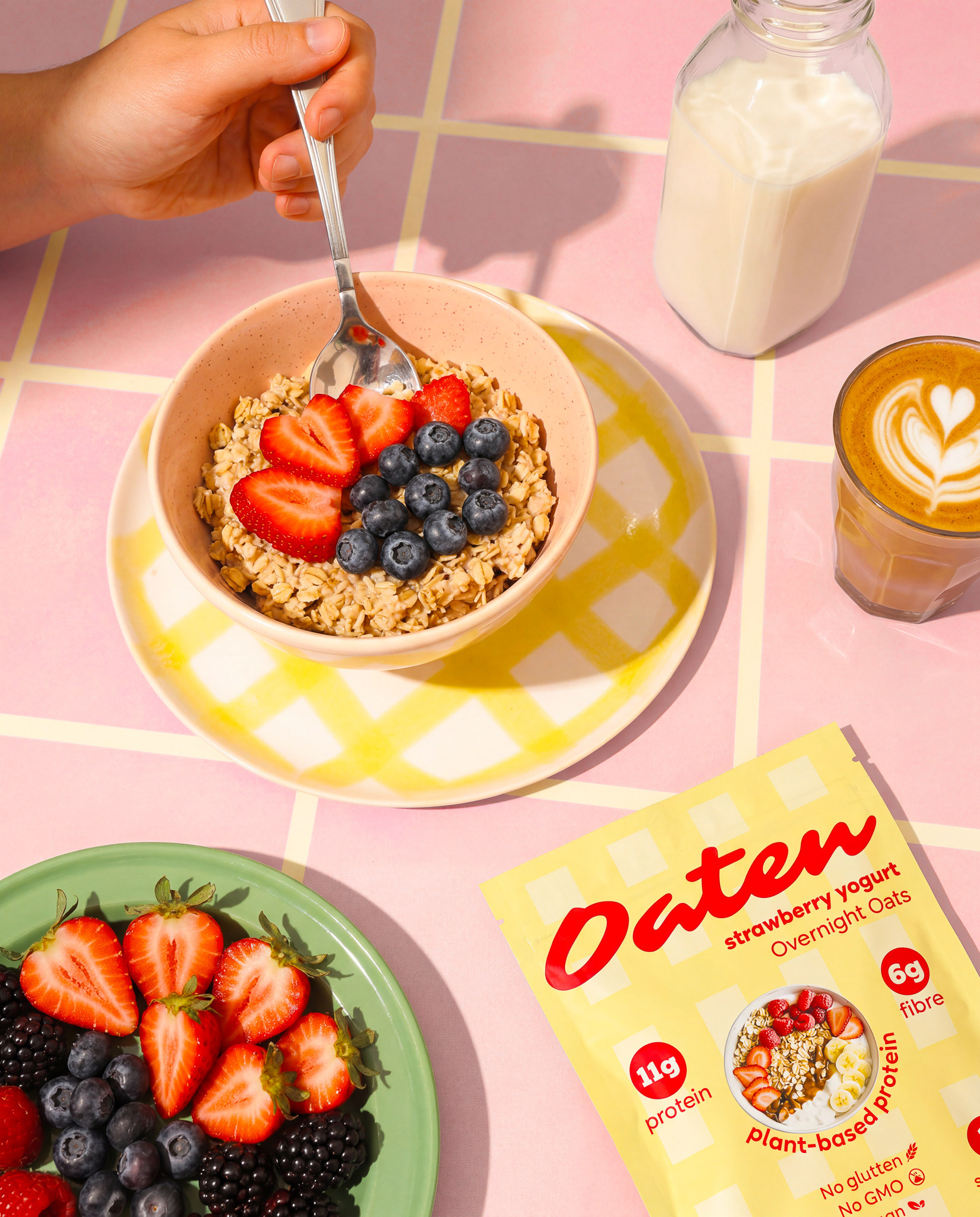
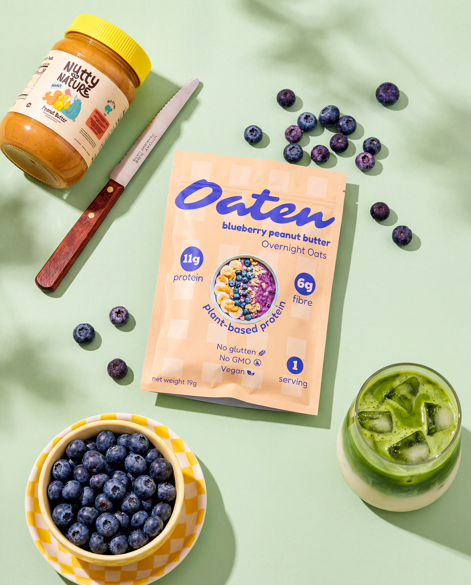
Oaten has two flavor profiles - strawberry yogurt and blueberry peanut butter.
The colors take inspiration from flavors profile, so red, blue and warm golden-brown will be primary attentive colors. The background pattern is inspired by the table cloth of square pattern .