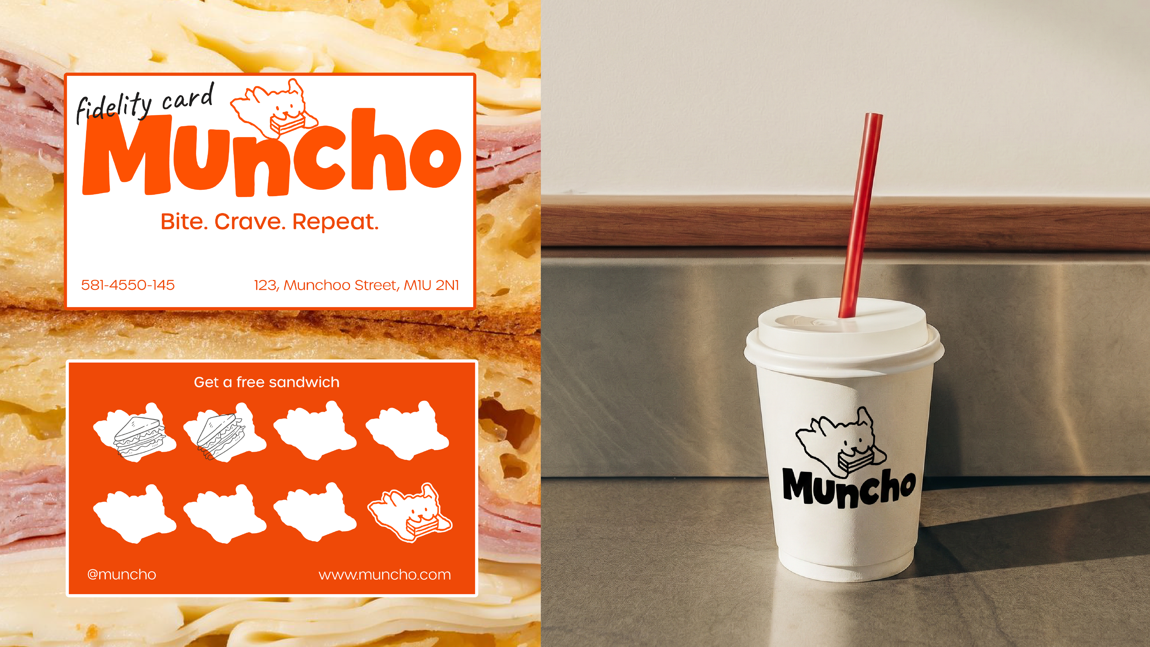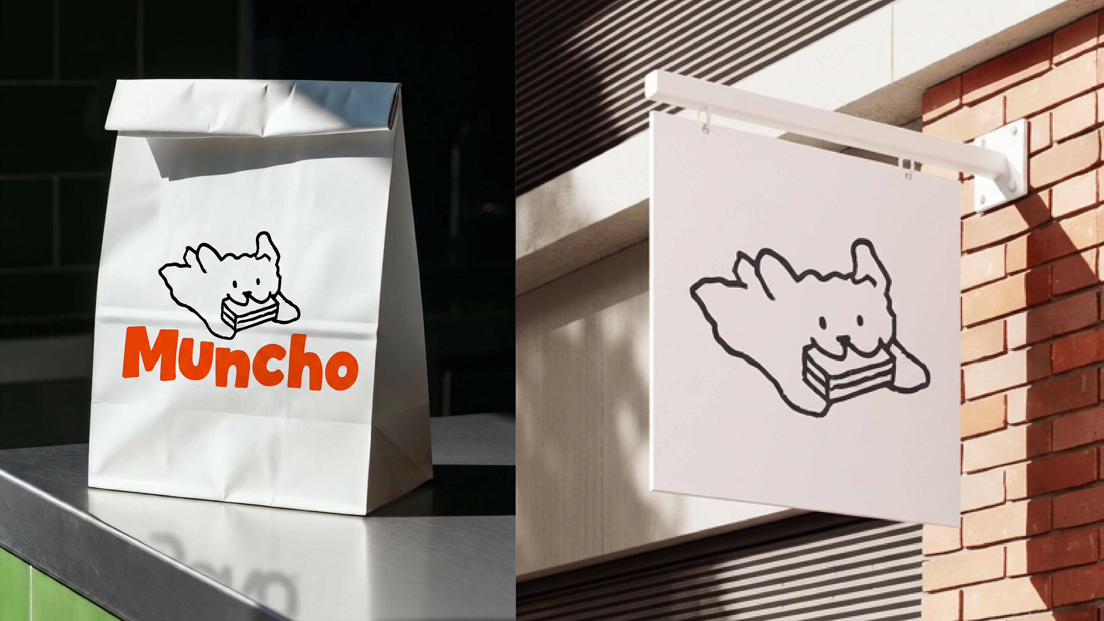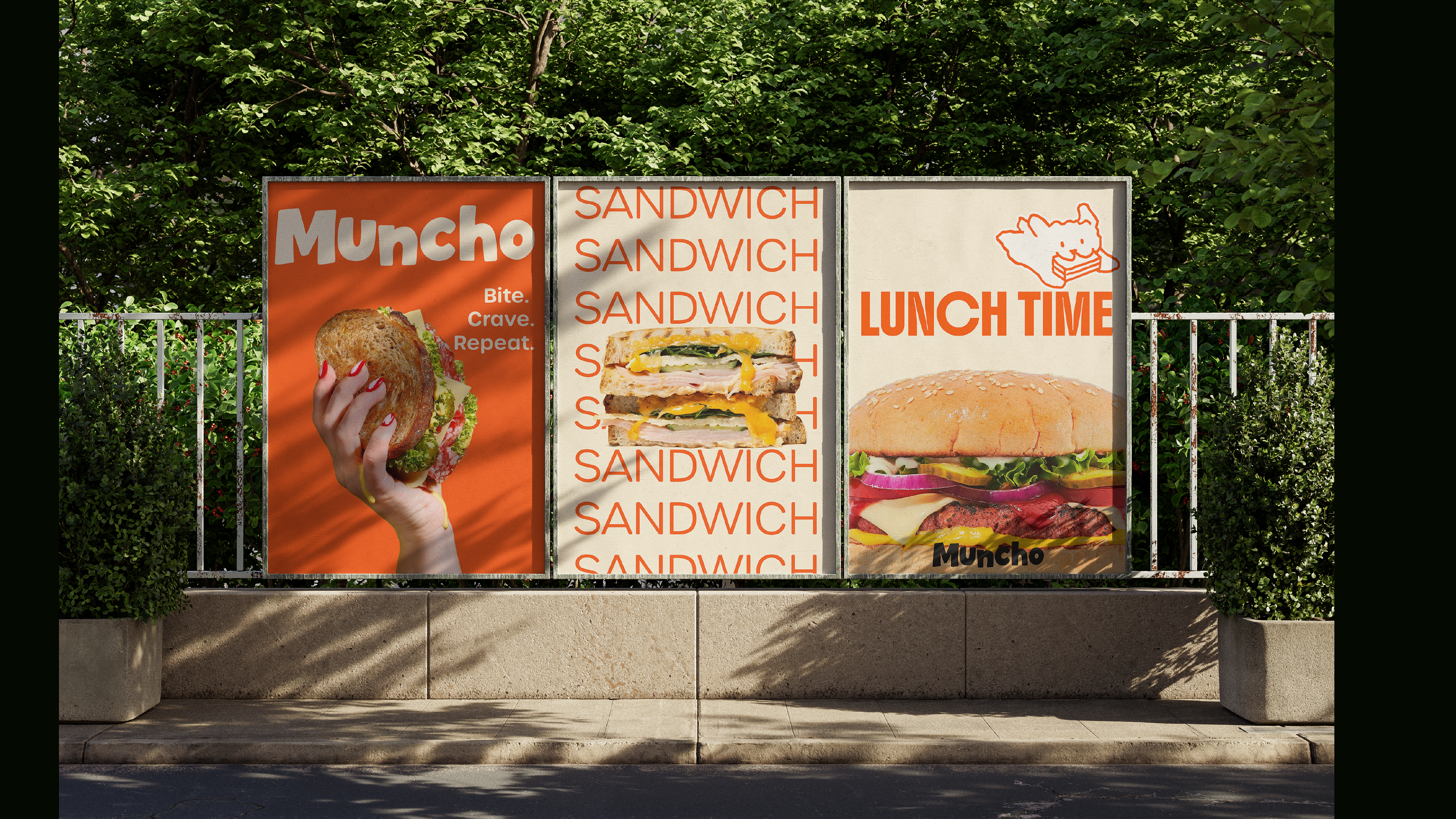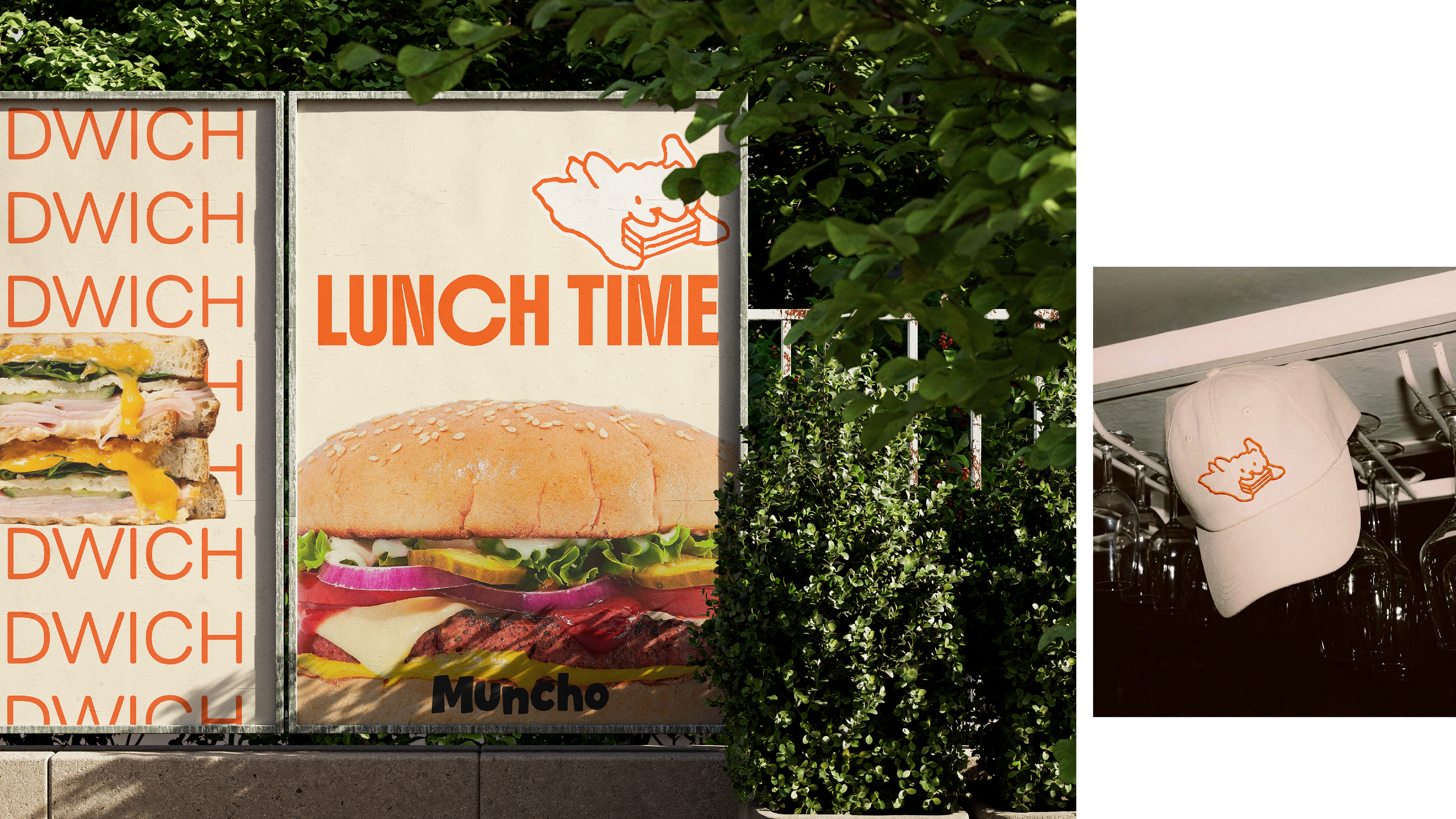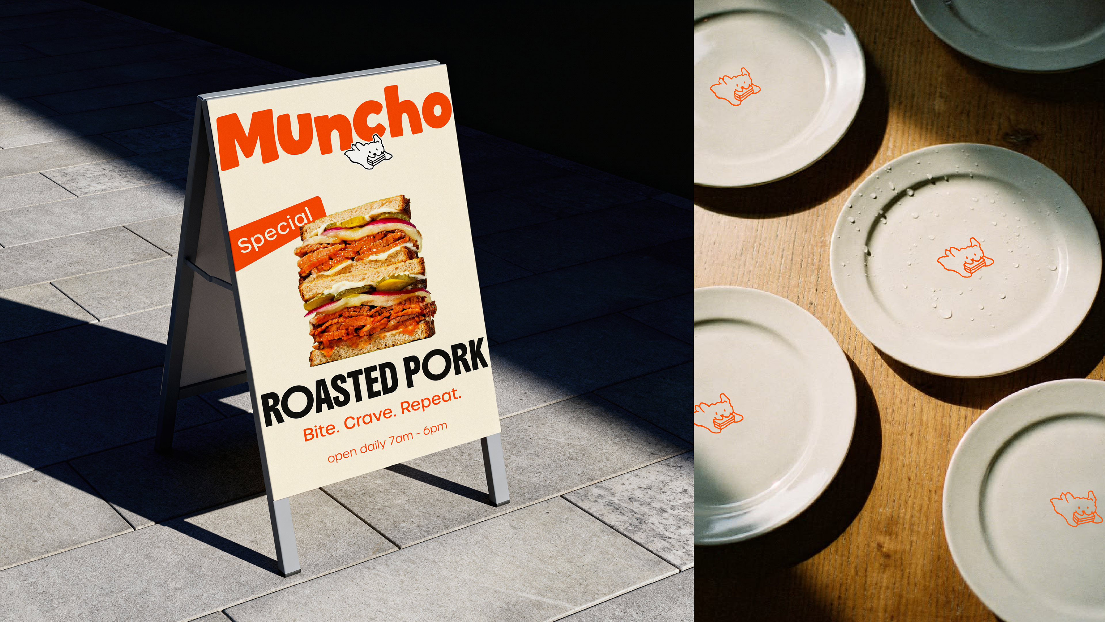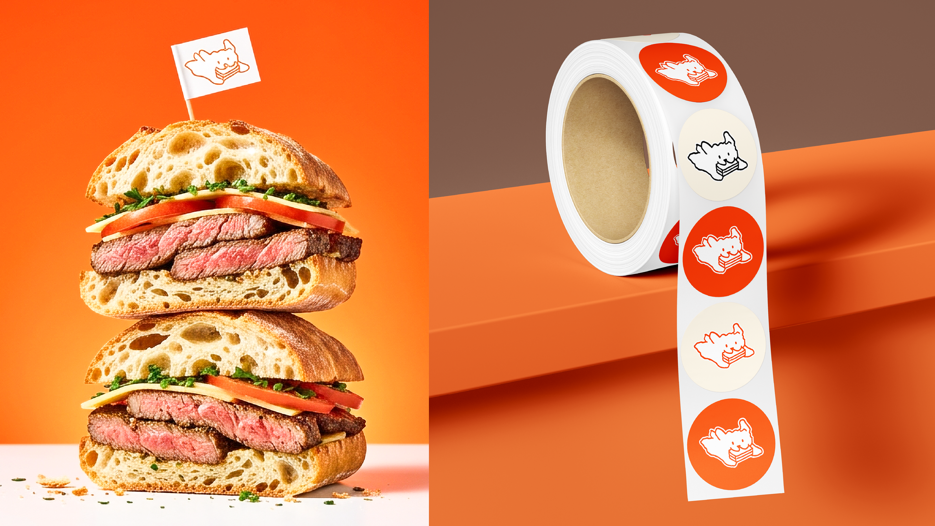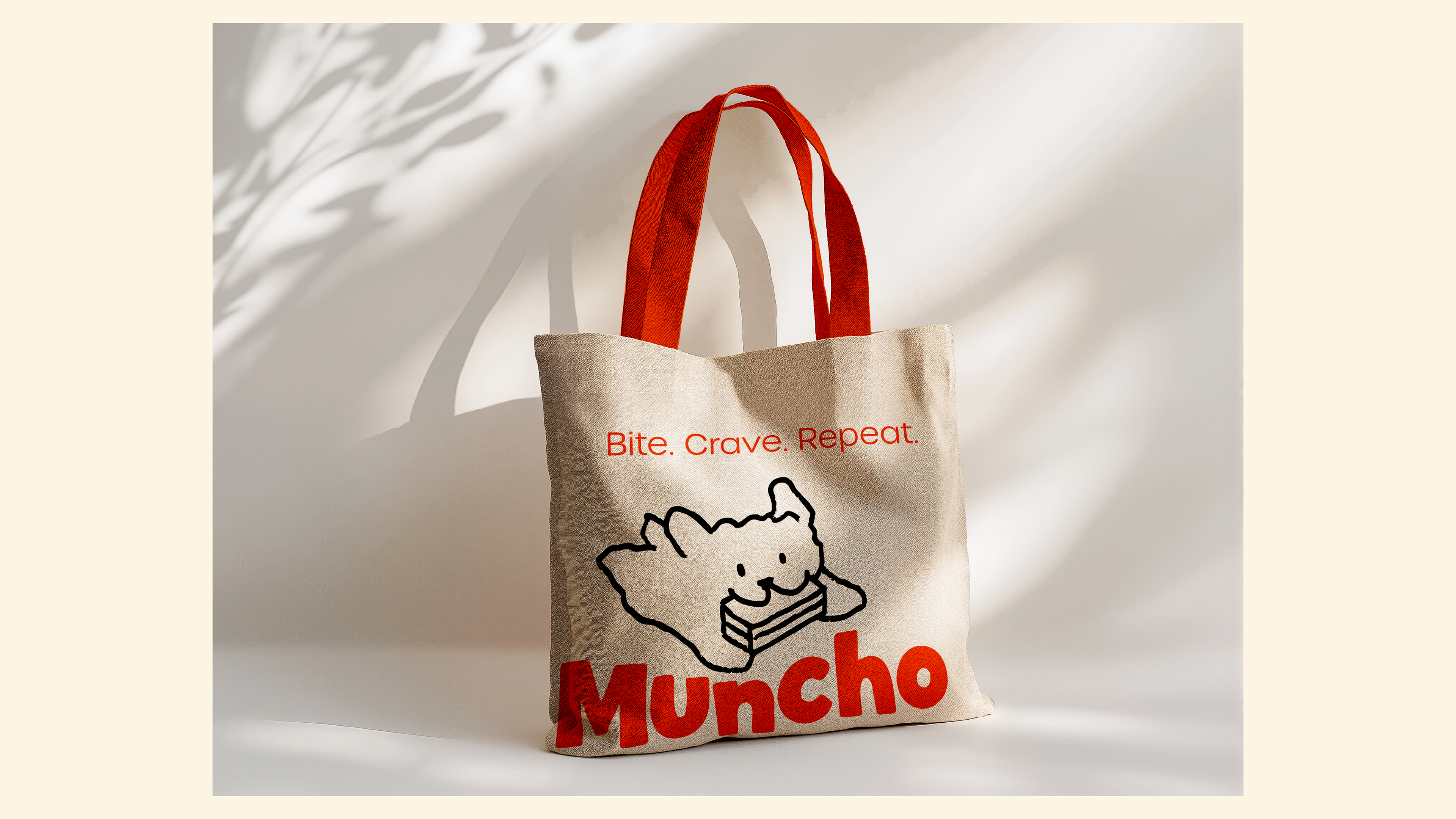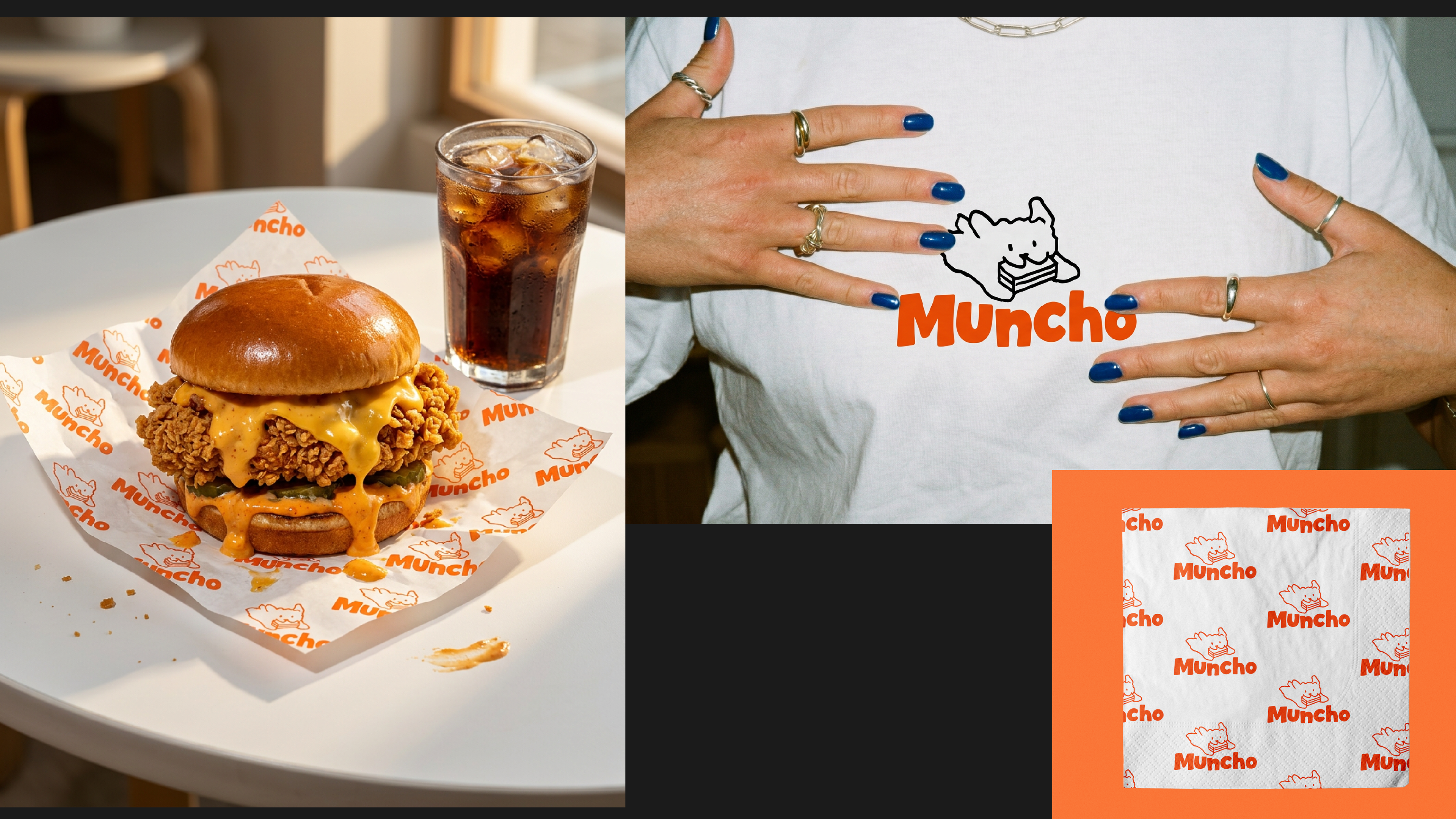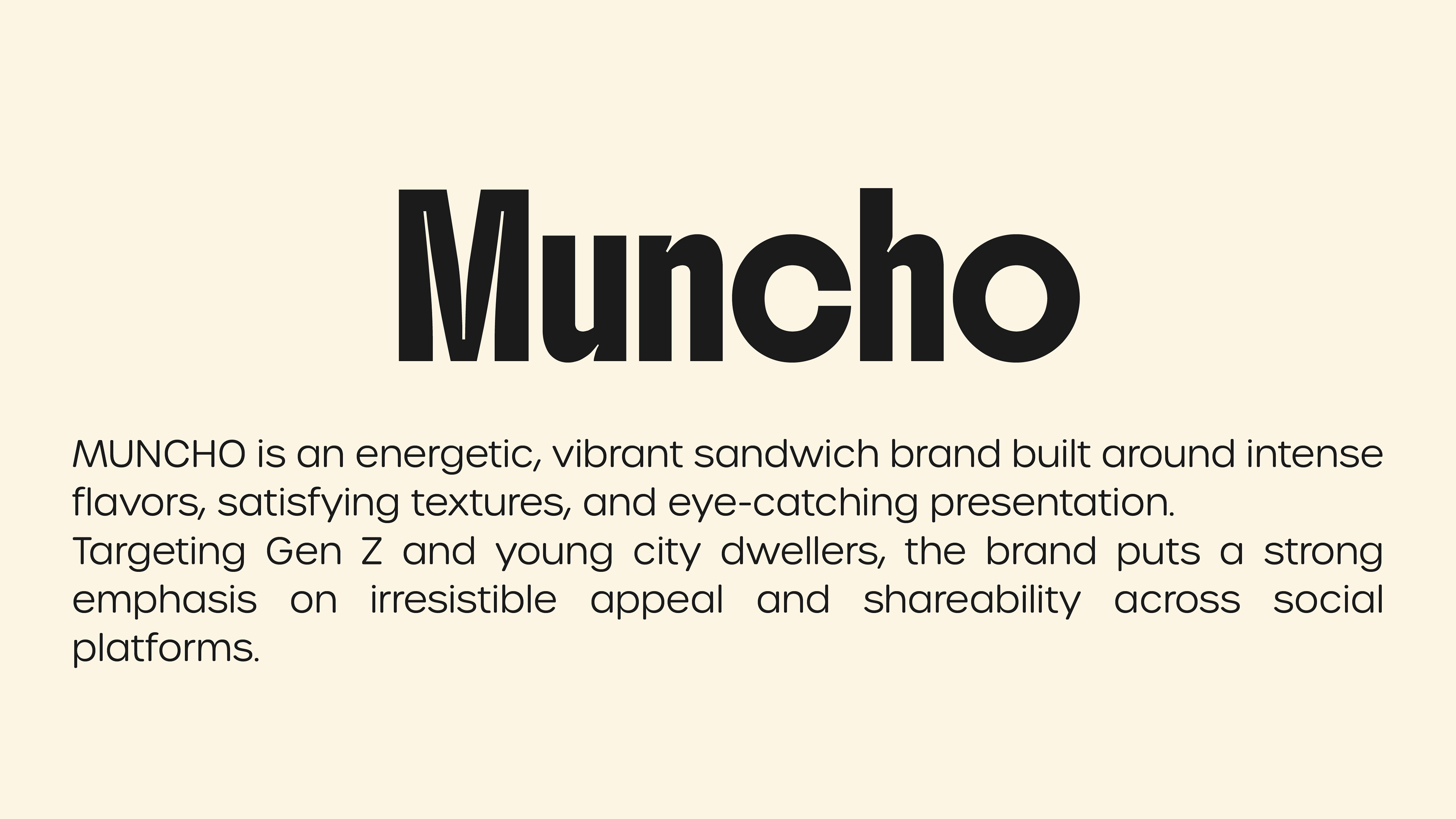
Sandwich brands tend to play it safe — too clean, too generic, too forgettable. MUNCHO needed to feel like the opposite of boring. I wanted it to have personality — the kind that makes you notice and smile before you even take a bite. The name "MUNCHO" already has energy and sound to it, so the visual identity had to match that loudness.
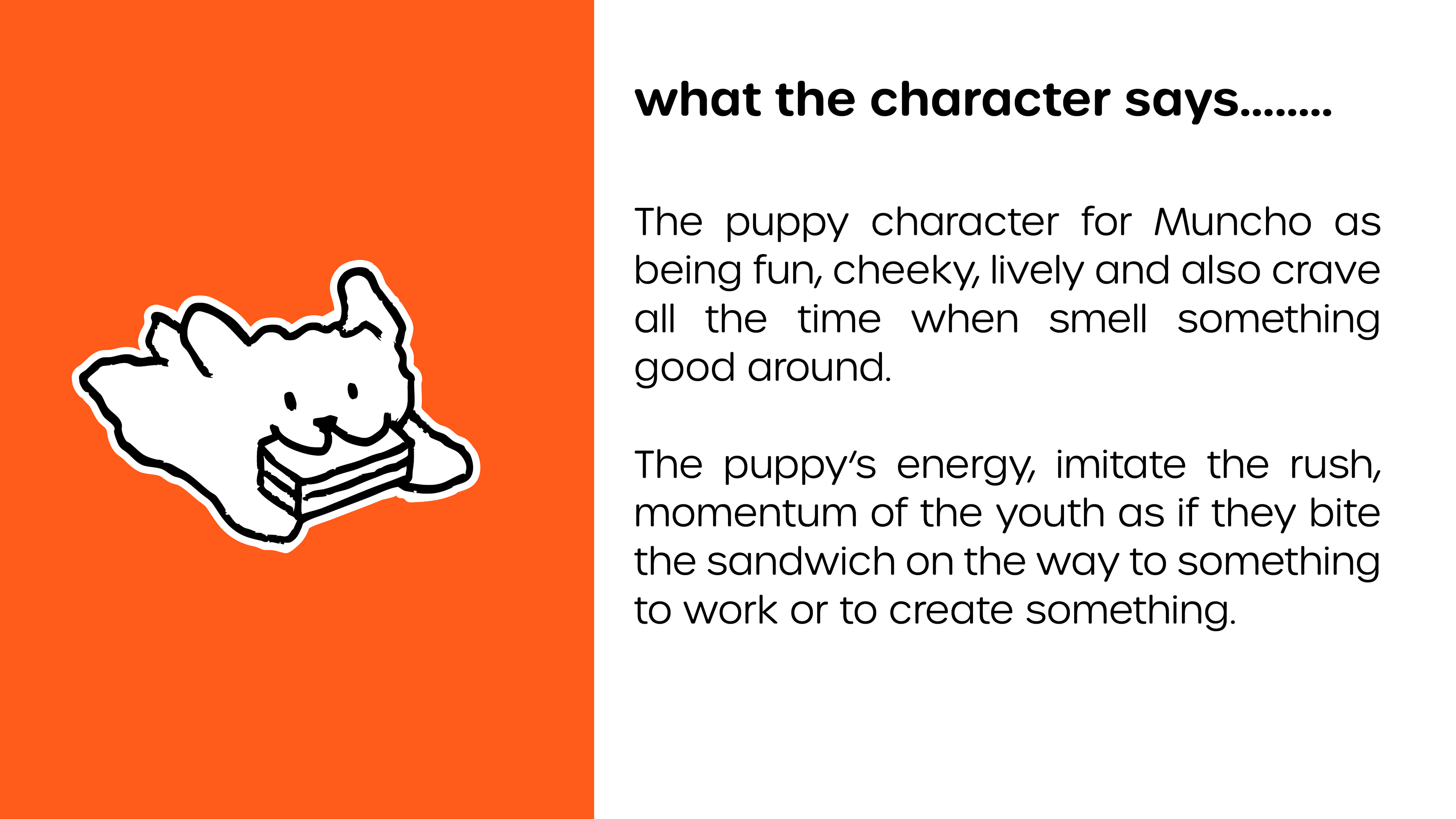
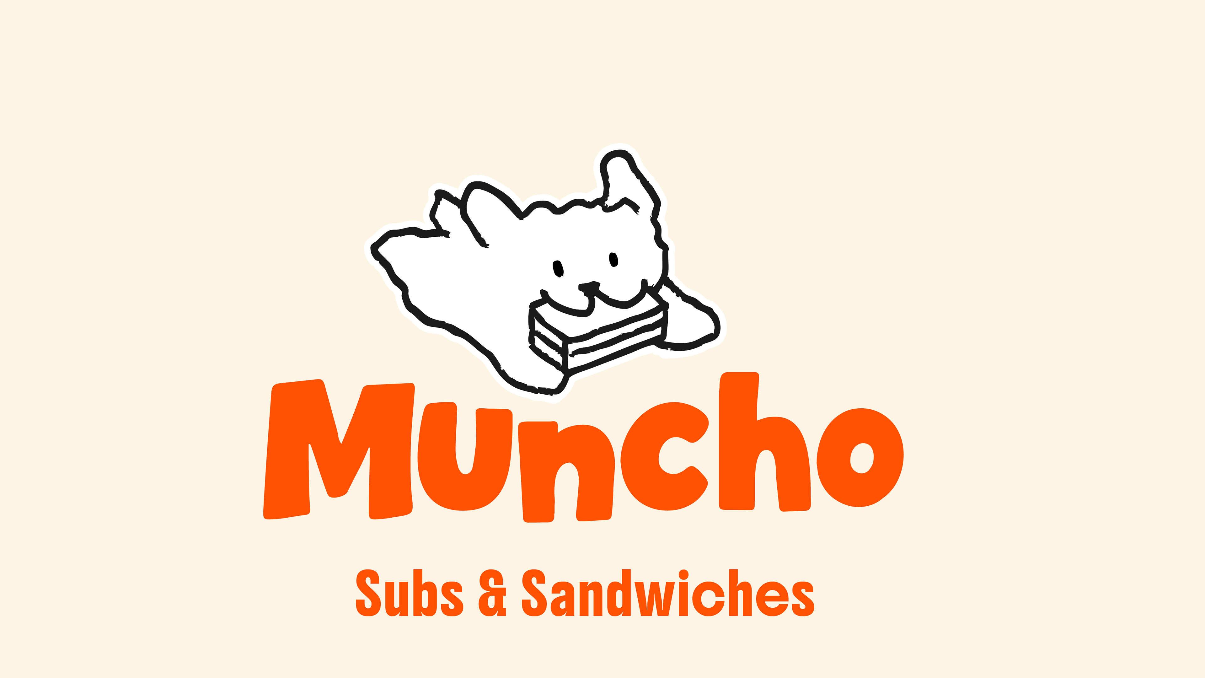
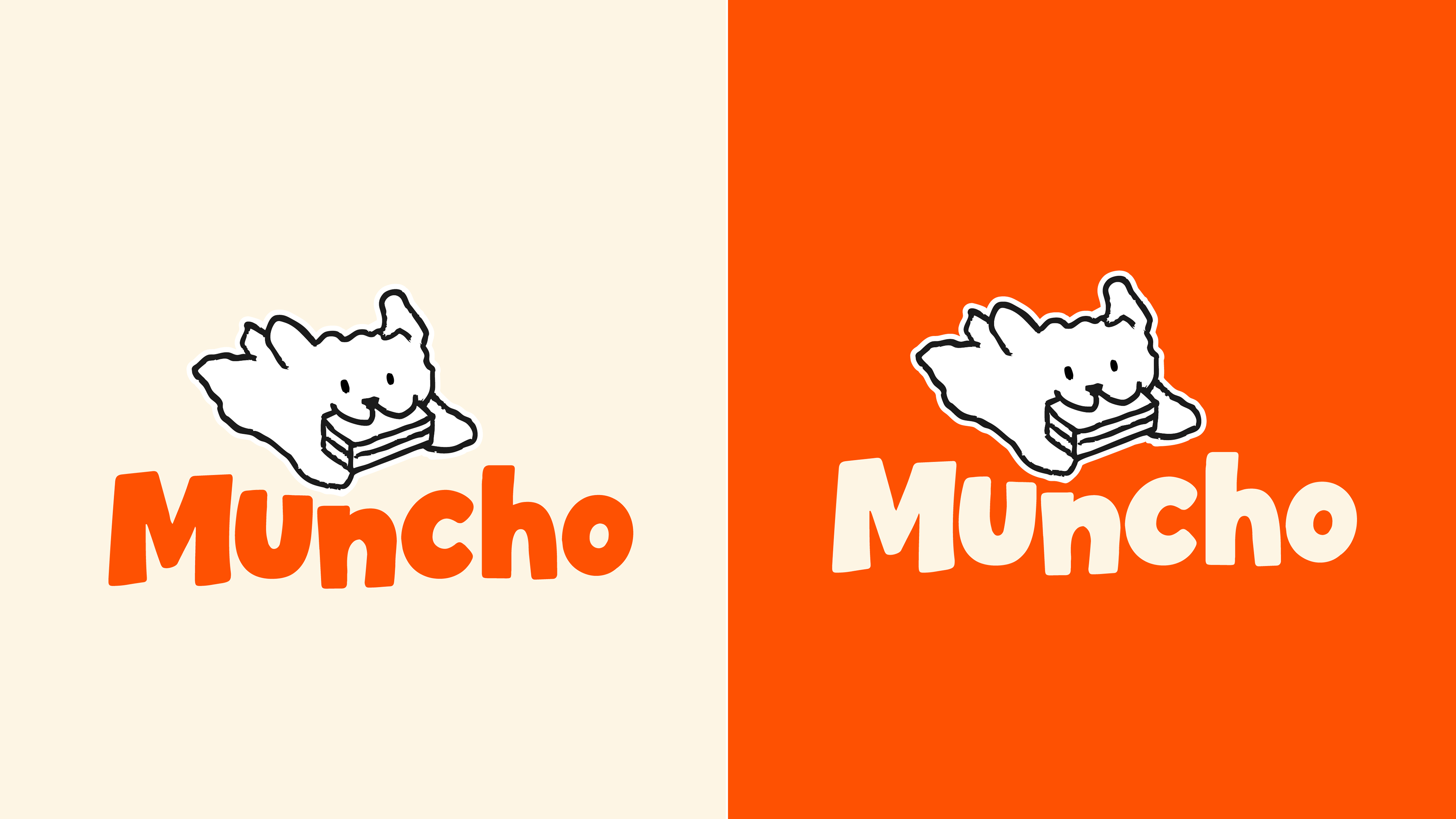
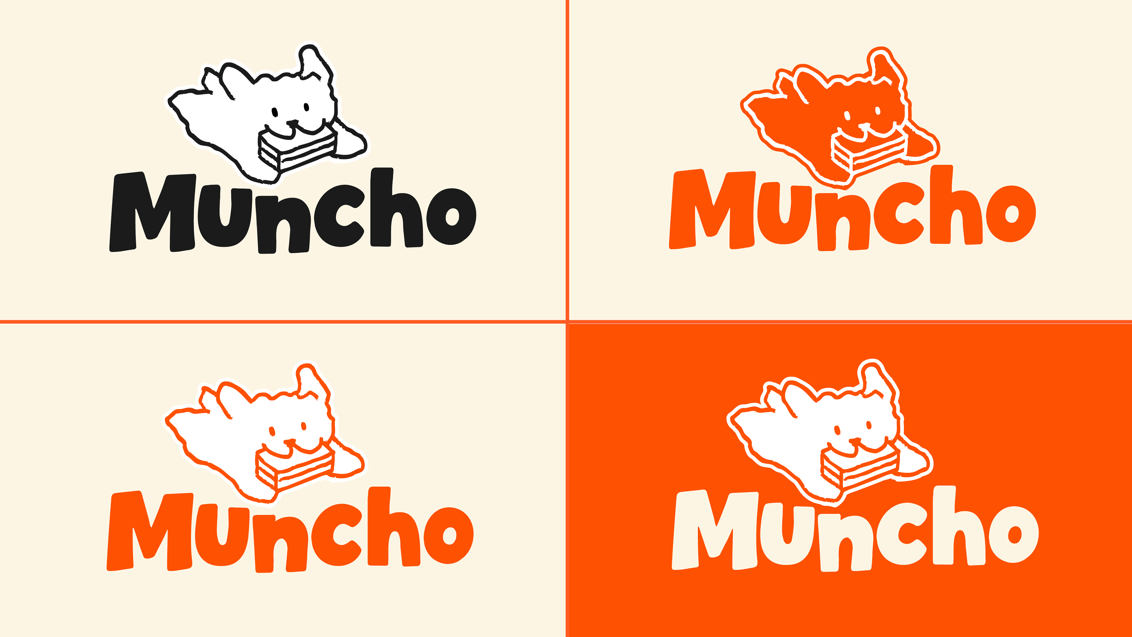
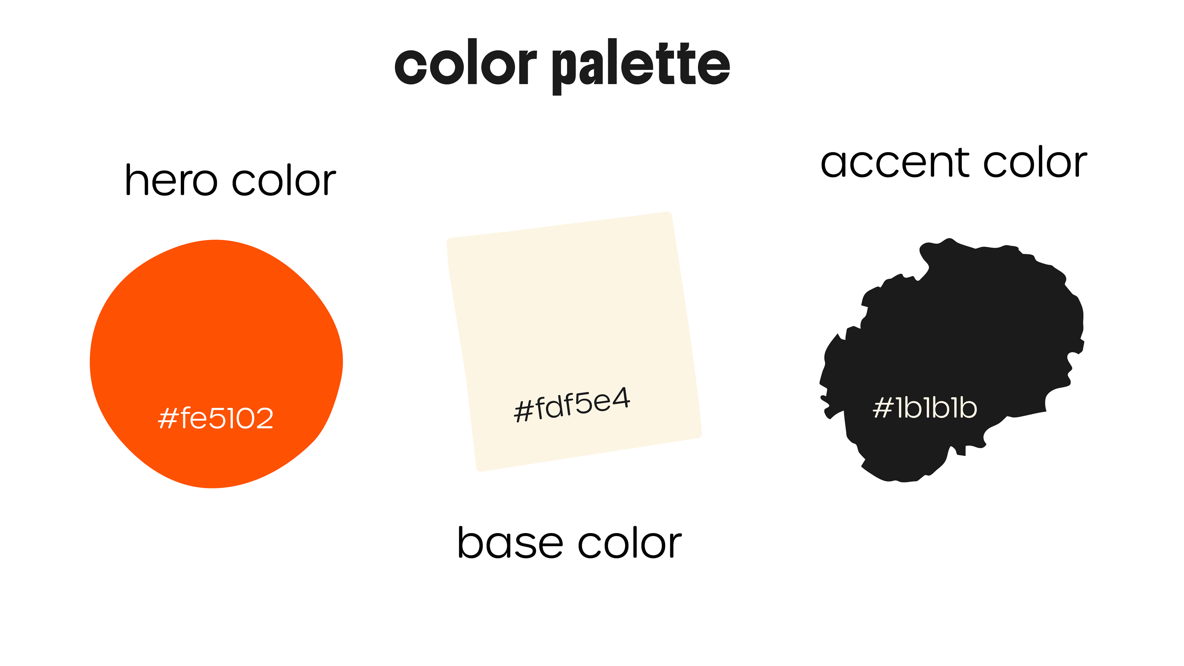
Brand uses bold, saturated colours to highlight High energy, appetite-stimulating, eye-catching.
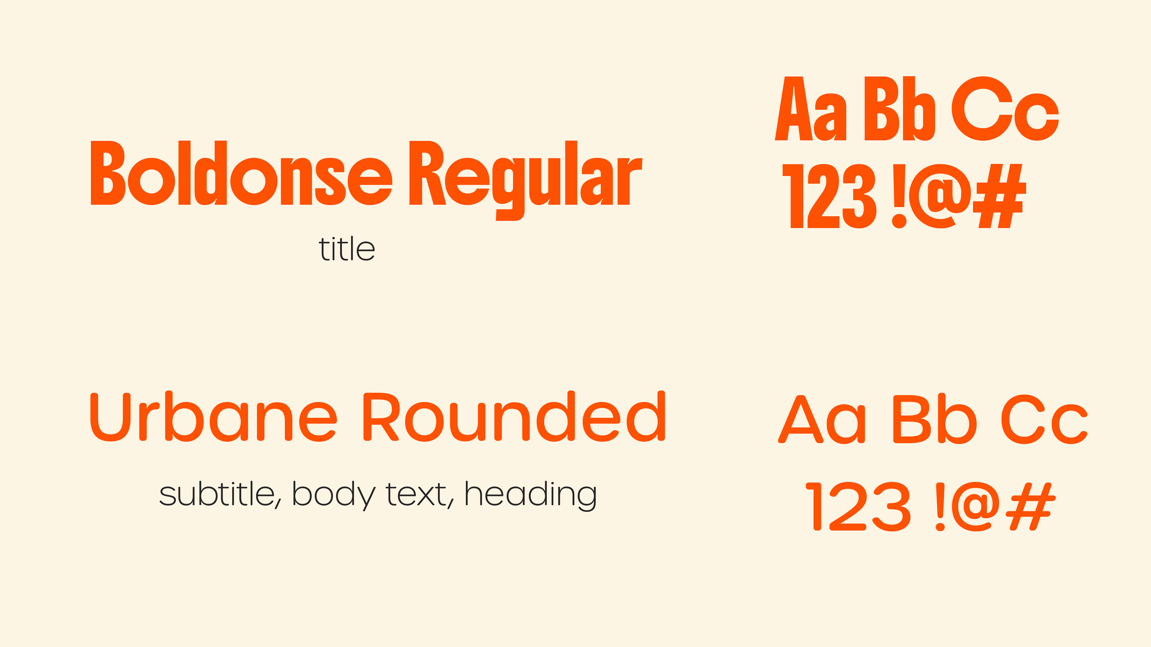
Chunky typeface and rounded expressive font reflect the brand's fun, unapologetic personality.
Playful, loud, unapologetic tone Speaks to a young, food-loving audience.
Overall the brand Dynamic, full of life. It reflect the one packed craving delicious sandwich.