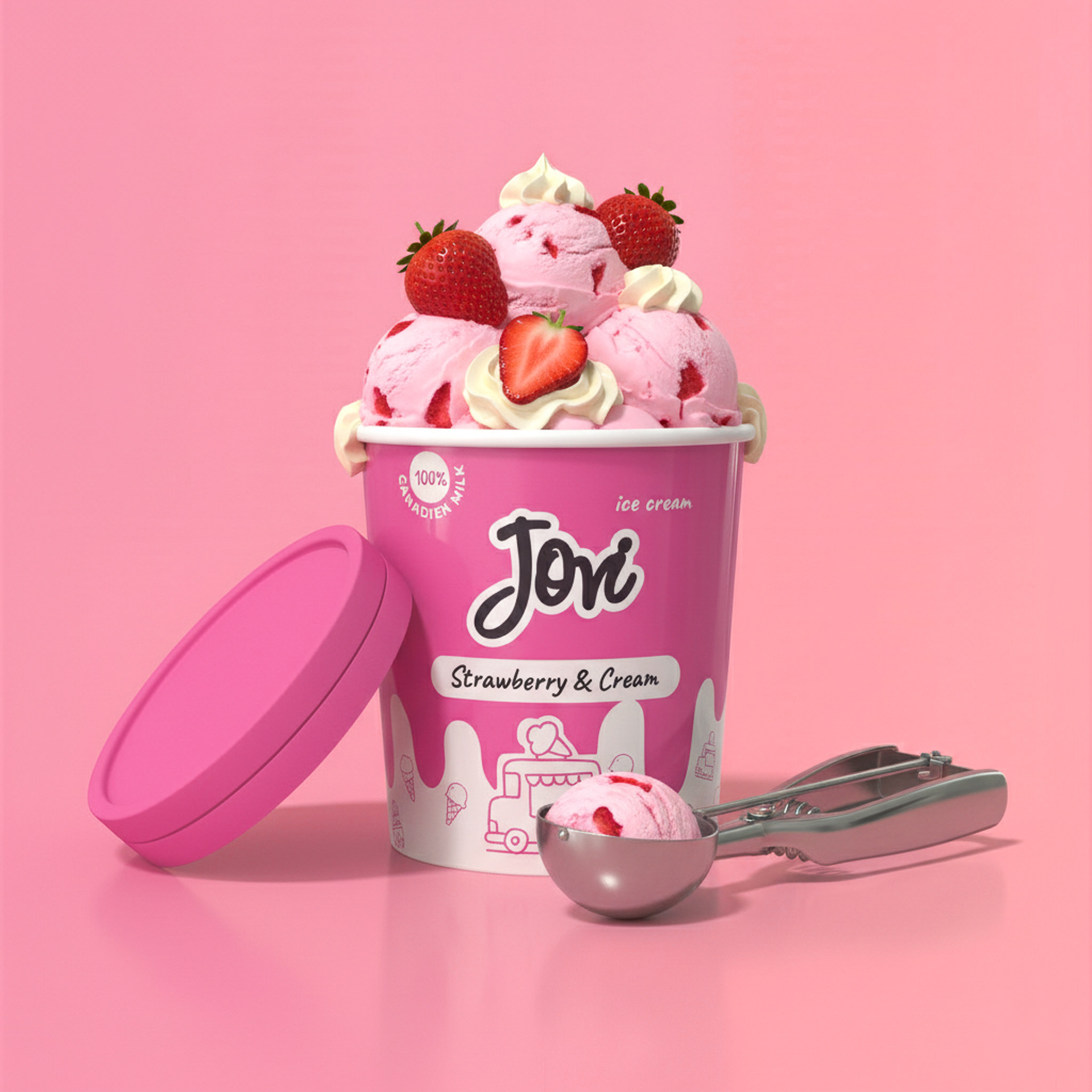
Jovi delivers a rich, full-bodied ice cream experience inspired by the timeless charm of neighborhood ice-cream trucks. Each scoop blends indulgent flavor with a sense of nostalgia, capturing the carefree spirit of long summer days. It’s a moment of pure comfort and joy — a simple pleasure that brings the past and present together in every bite.
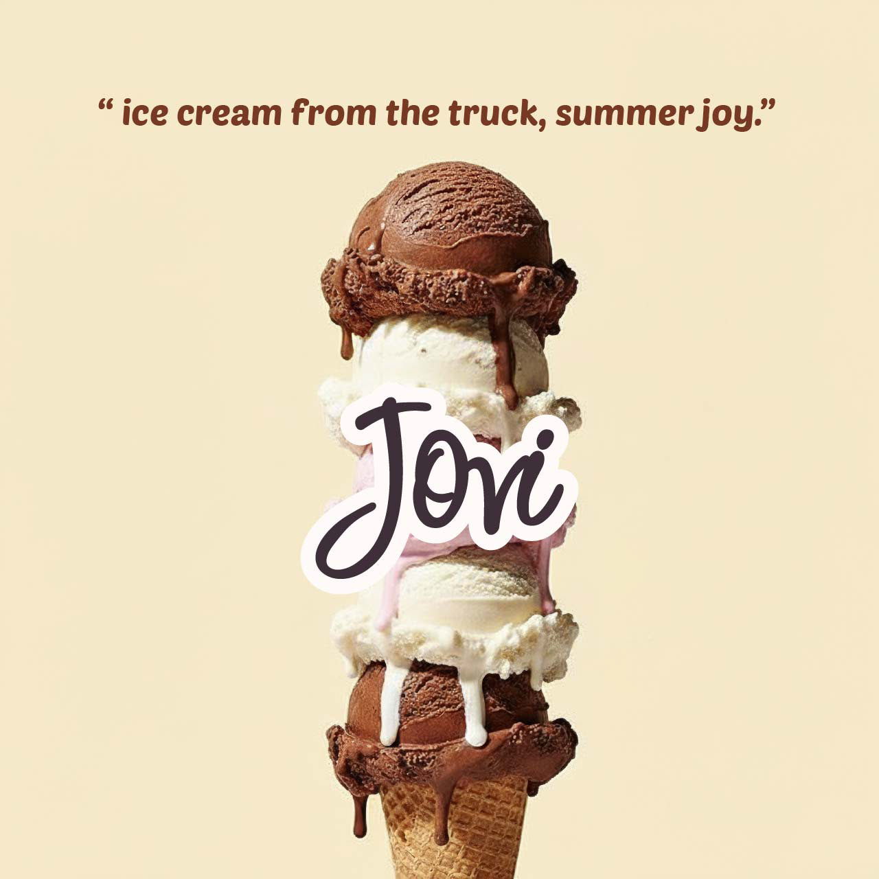
“Bringing Back the Sweetness.” Jovi
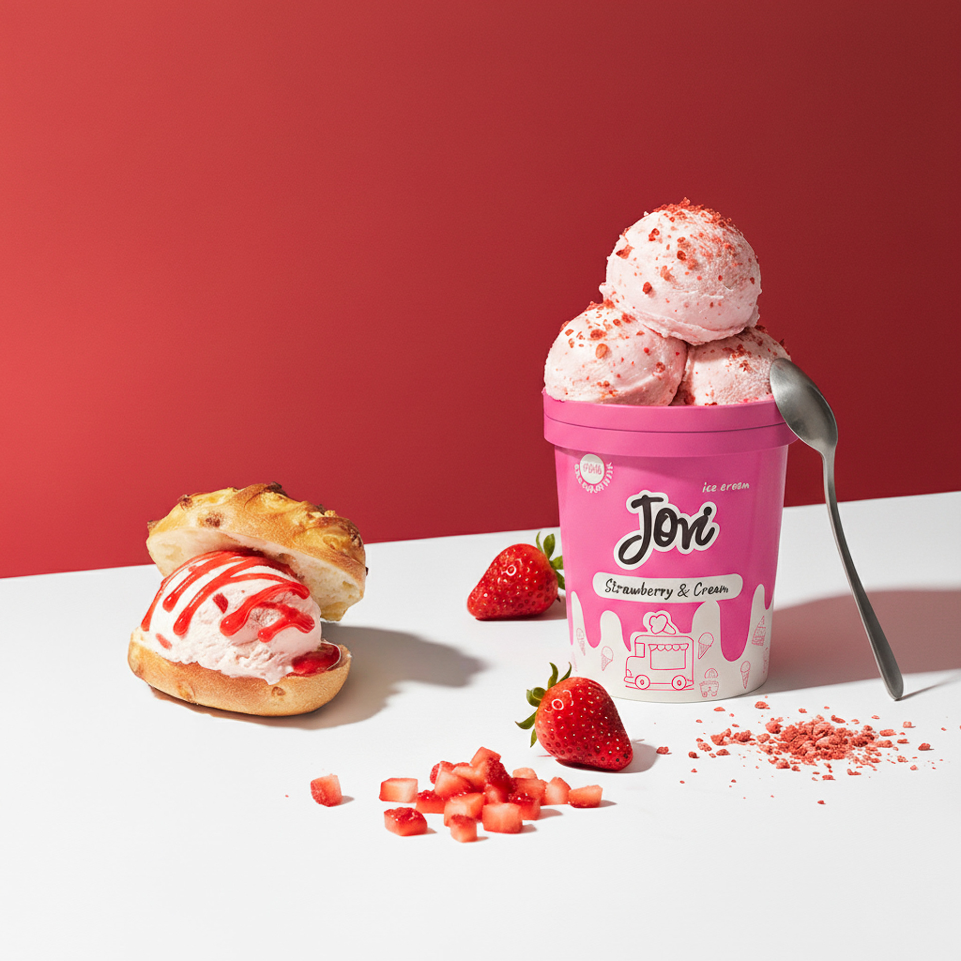
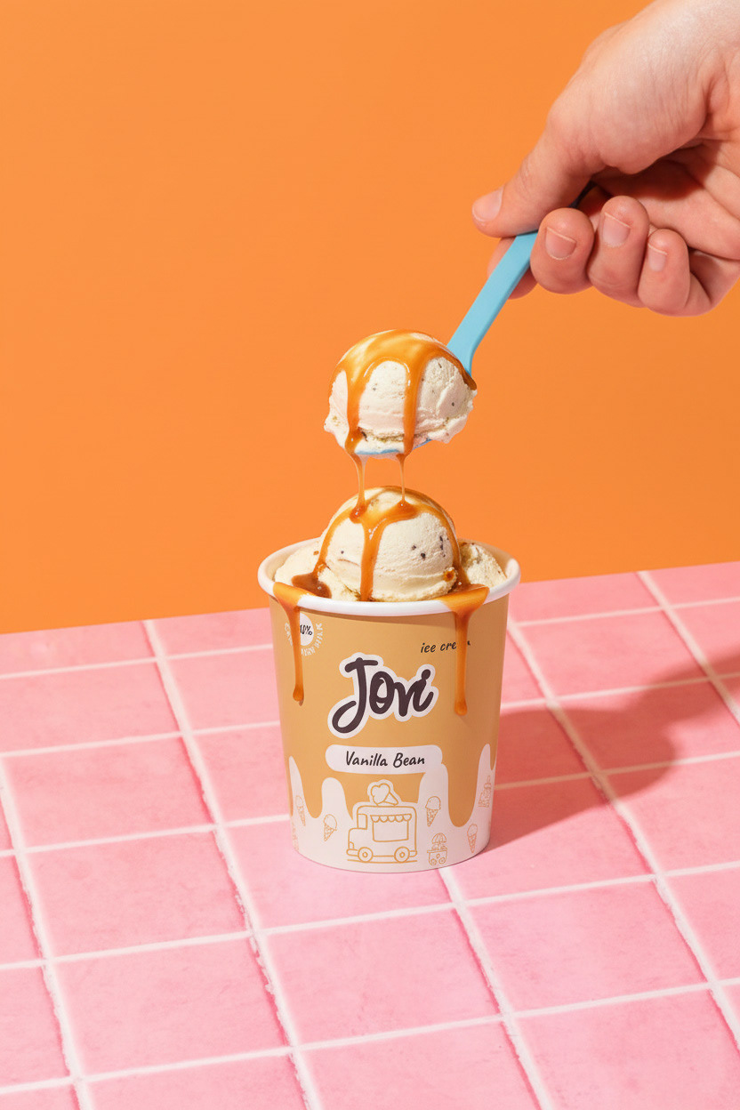
The concept was inspired by the timeless experience of the ice cream truck rolling down your street on a summer afternoon — that moment of pure childhood excitement. The goal was to reinvent that feeling for today: nostalgic enough to feel familiar, modern enough to feel fresh.
Most premium ice cream brands today go one of two ways — ultra minimal and sleek, or overly rustic and artisanal. But for Jovi, it needed to live in a different space entirely — warm, indulgent, and full of personality.
My creative hypothesis was: "What if nostalgia was the main ingredient?" so, the design had to make someone pick up the pack and immediately feel something — a memory, a summer, a smile.
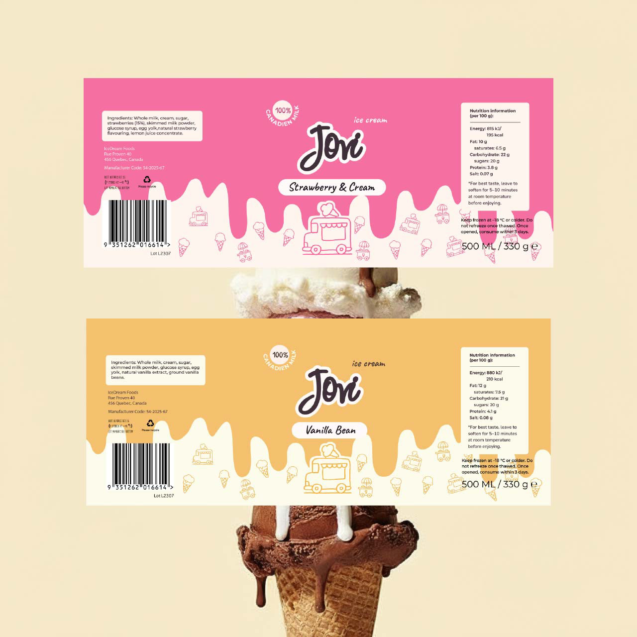
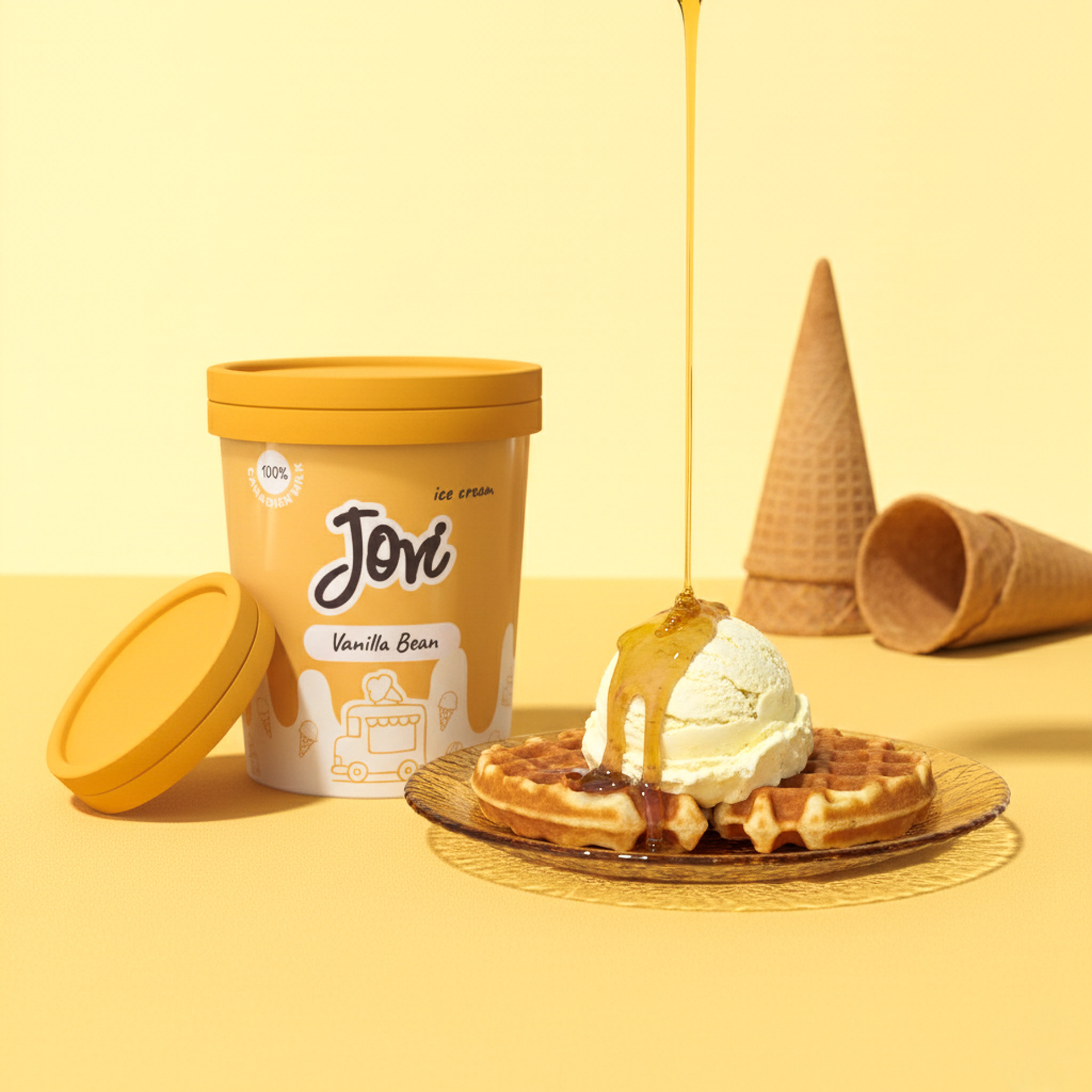
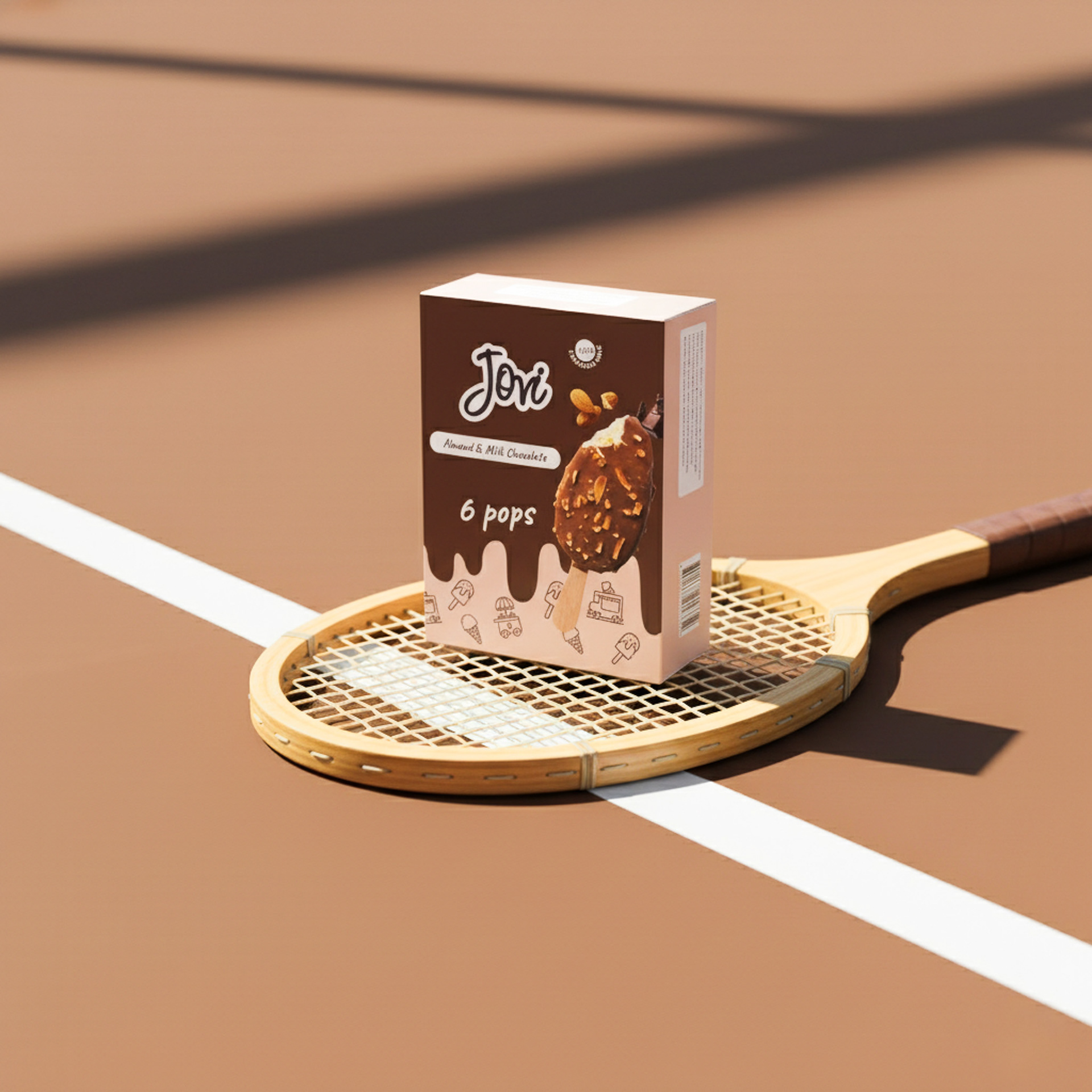
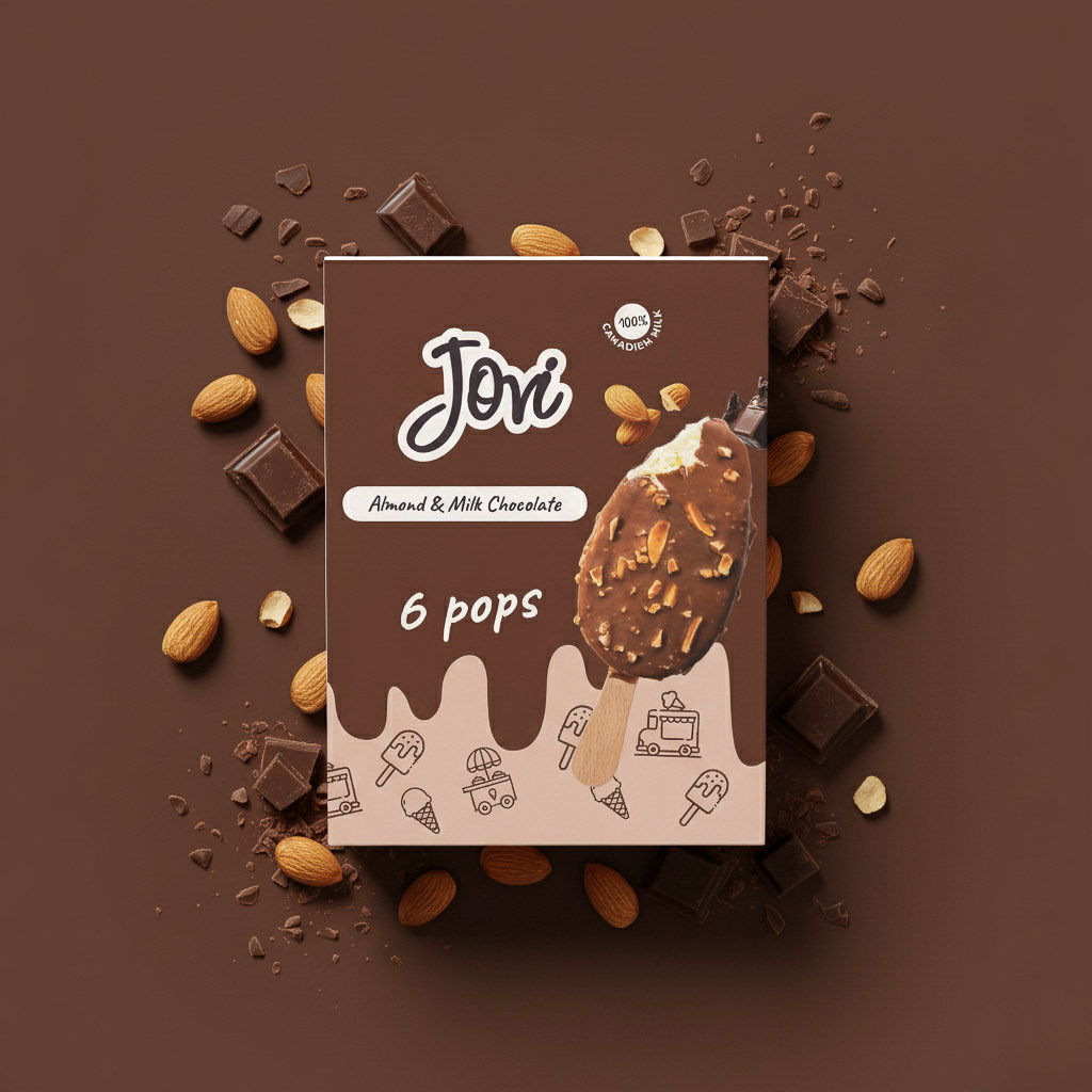
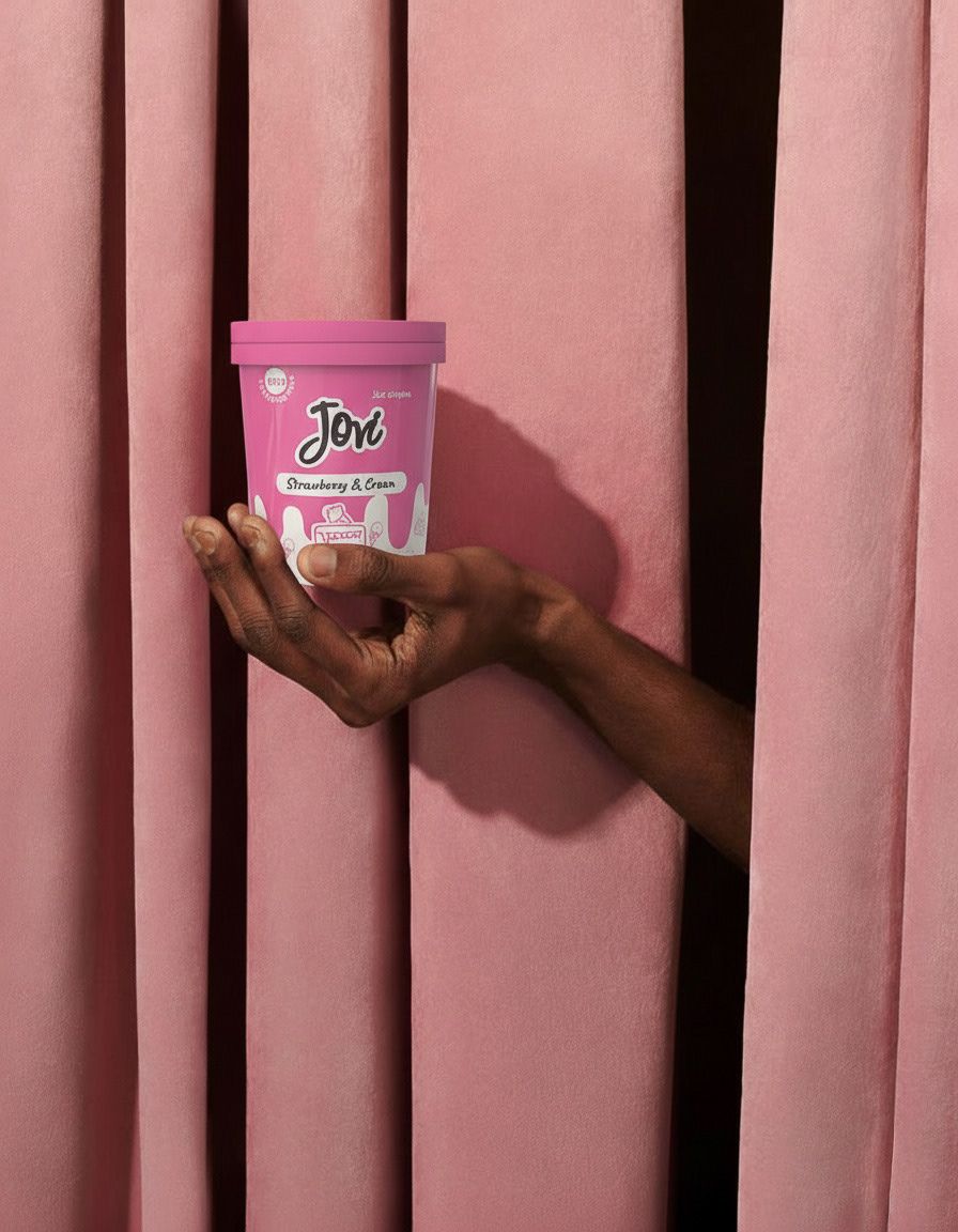
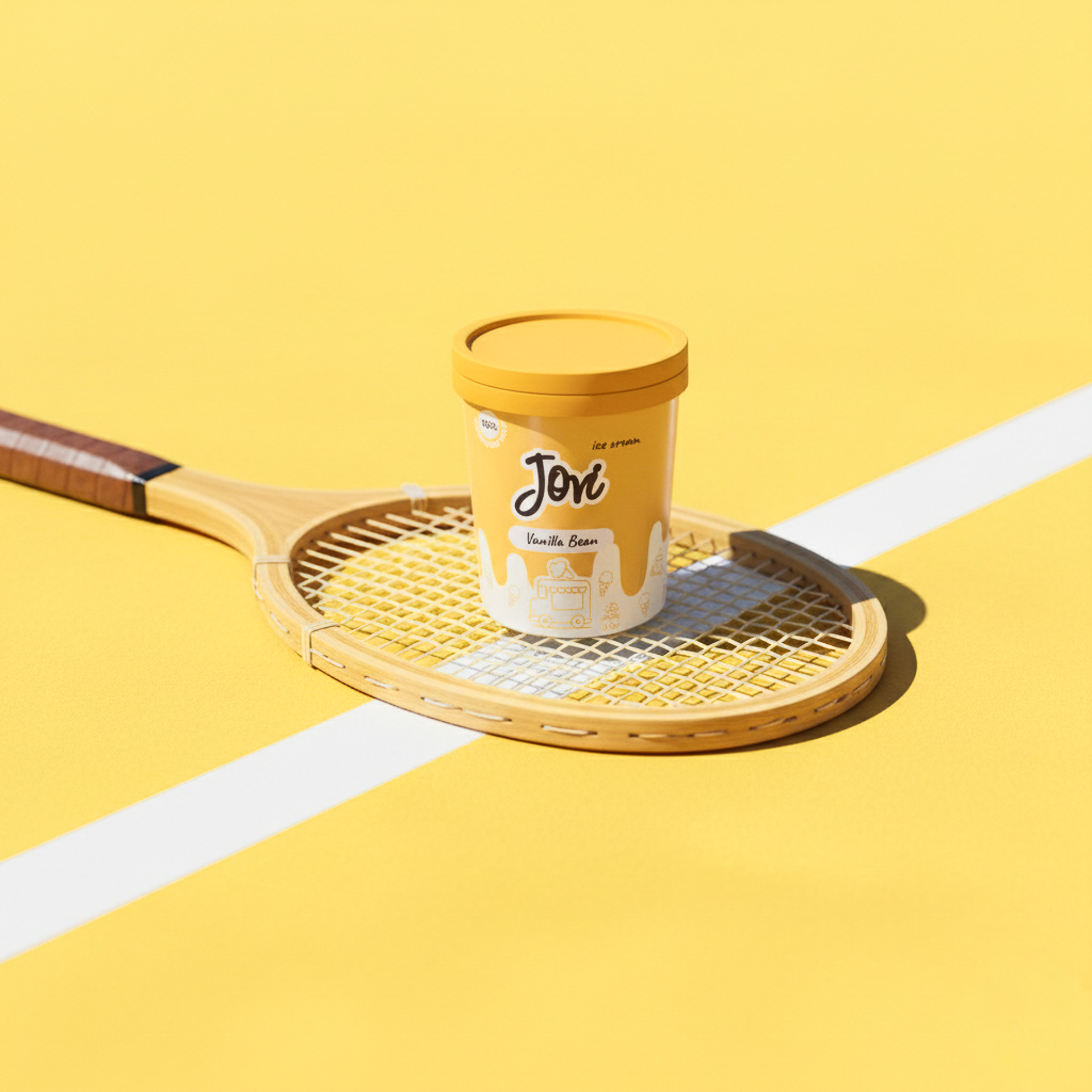
Jovi uses warm and saturated tones to spark indulgence, warmth, and summer feeling. Retro-inspired wordmark- Jovi and the handwritten display font feel approachable and playful. Retro-modern graphic illustrations bridge the past and present — nostalgic but not dated.
This overall tone of Joy, indulgence and warmth stirs the memory of chasing the ice cream truck down the street.