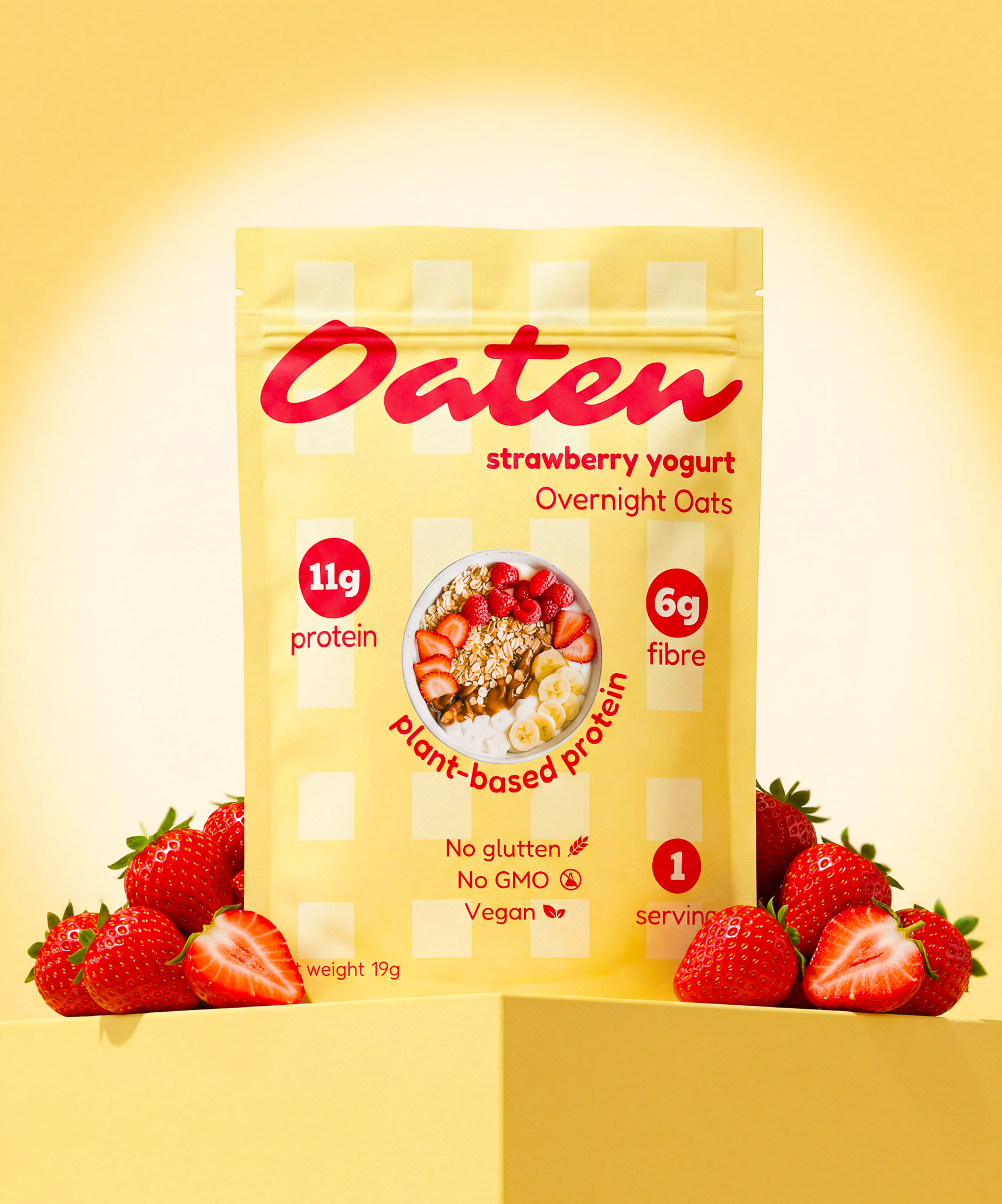
Oaten is a plant-based overnight oats brand built around clean nutrition — gluten-free, non-GMO, and vegan. The packaging is about communicating health and wholesomeness without falling into the trap most health food brands fall into — cold, clinical, and forgettable. For Oaten, Healthy doesn't have to be boring. The packaging can be felt nutritious and trustworthy — but also modern enough to stop a scroller.
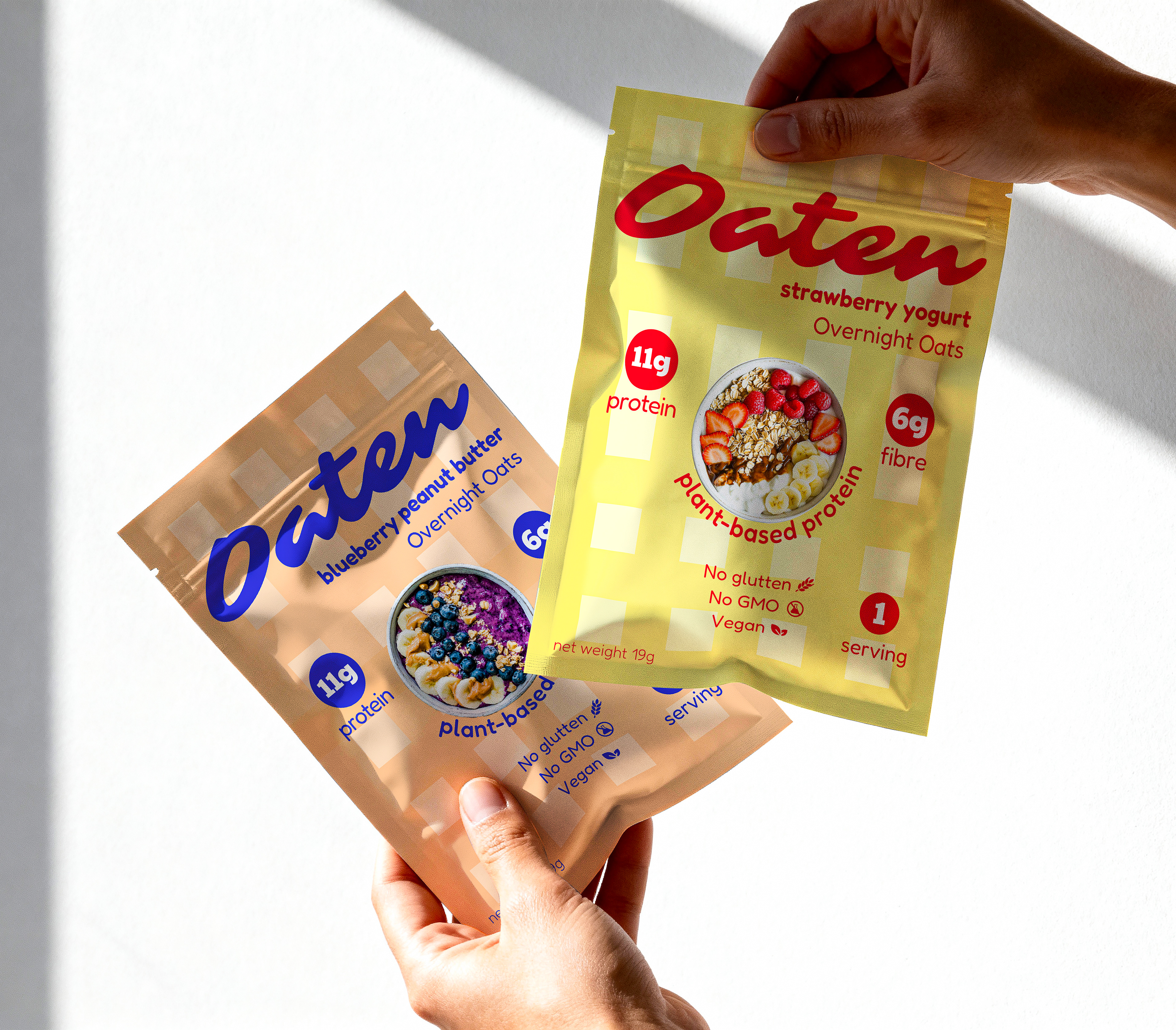
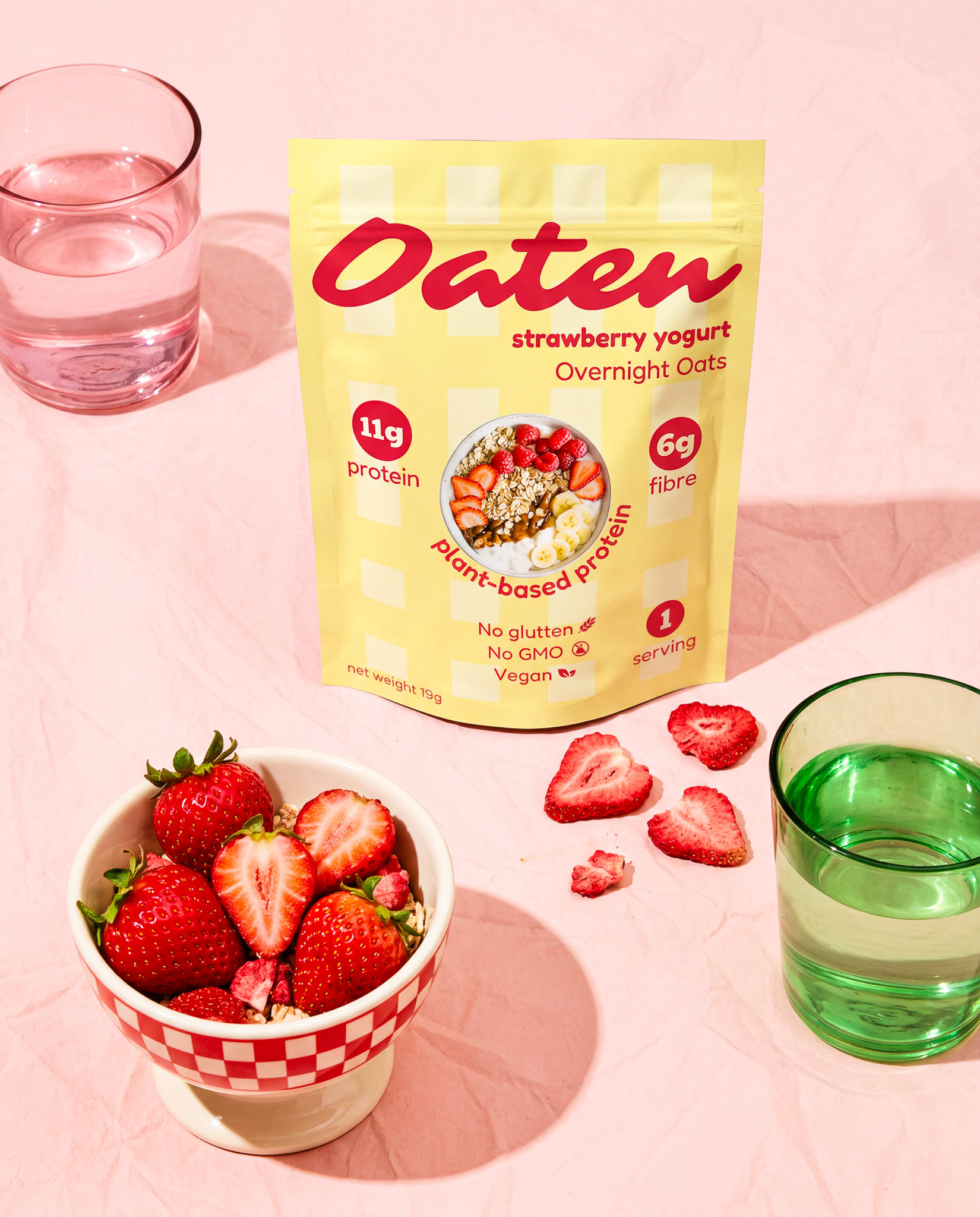
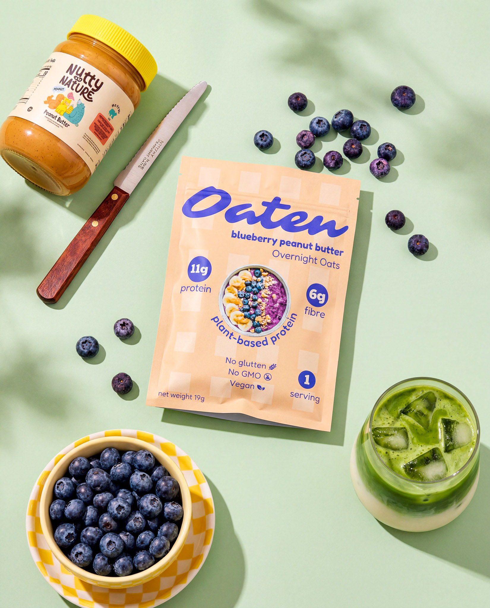
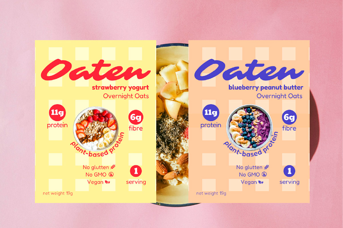
Logo mark "Oaten" is friendly, warm and trustworthy. All infos are written in sans-serif with the purpose of clarity and readability.
Bold circular badges (11g protein, 6g fibre) for callouts that can be scannable at a glance for customers..they can see the benefits immediately and clearly enough.
Oaten has two flavor profiles - strawberry yogurt and blueberry peanut butter.
The colors take inspiration from flavors profile, so red, blue and warm golden-brown will be primary attentive colors. The background pattern is inspired by the table cloth of square pattern .
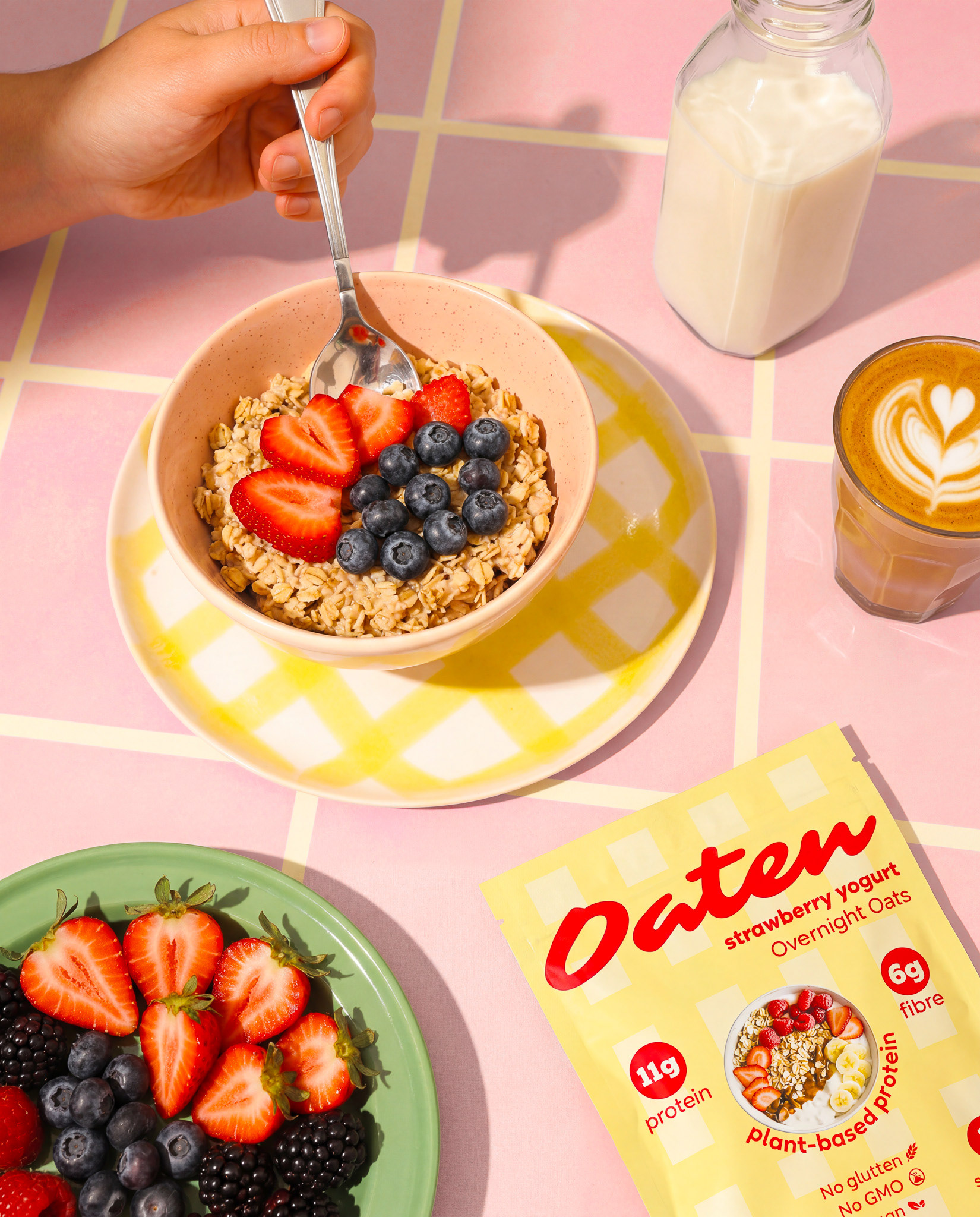
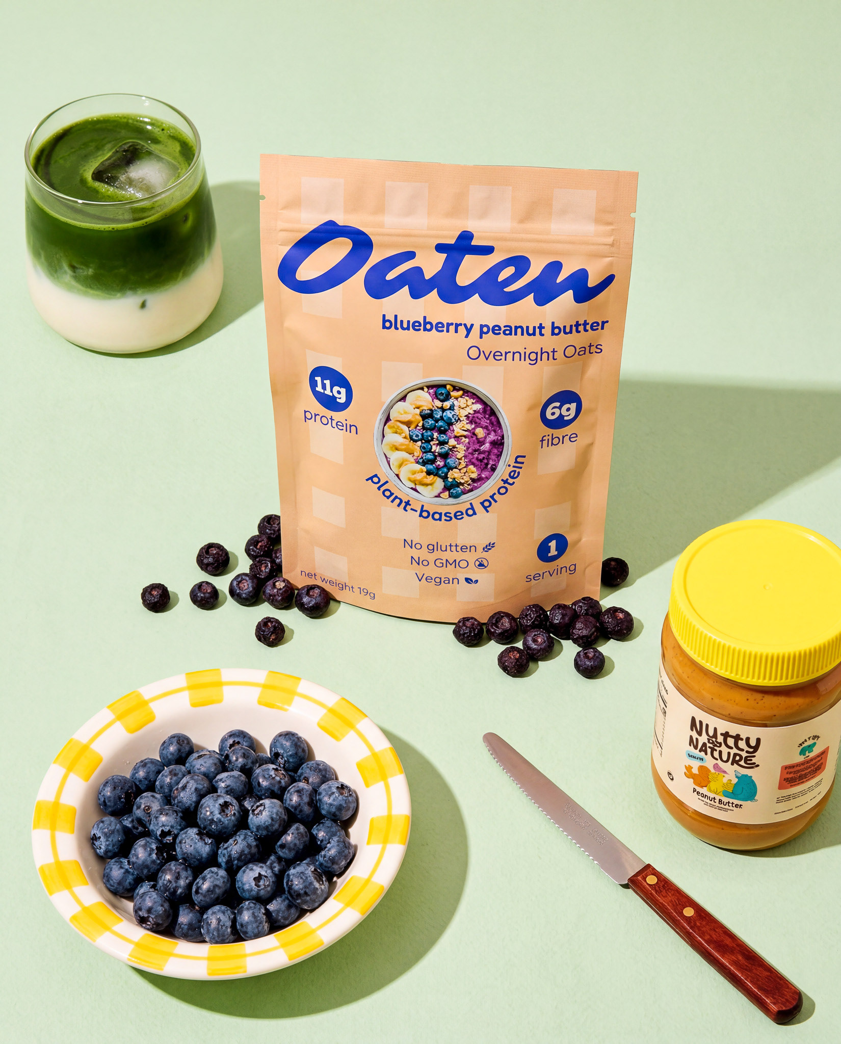
Real fruit, checkered bowls, table knief, coffee cup, coloured glassware are styled to give a Retro-modern accent. The background is muted pastel of sage green and pink that is not aggressive but supportive the packaging. This overall visual make the products feel tangible and craveable.
Oaten now has a packaging identity that is shelf-ready and scroll-stopping. The flavour-coded colour system makes variants instantly recognisable while keeping the brand feeling cohesive. The combination of friendly typography, bold nutritional callouts, and prop styling creates packaging that communicates health, taste, and personality all at once.